Supercharging America's Carrier Fleets Through Mobile-First Experiences
Truckstop Go
Trucking is the lifeblood of moving goods in North America, supplying businesses and consumers with natural resources and manufactured products. There are nearly 400,000 truck drivers in United States and Canada who identify as owner-operators, drivers who own their trucking business as opposed to driving for a carrier fleet. These O/O's are entrepreneurs at heart, aiming to utilize all resources available to them, while also expecting quality and consistency from the resources they use.
Truckstop operates in a large competitive landscape of digital freight-matching solutions, mentioned alongside popular names such as DAT, Uber Freight, and JBHunt. In a nutshell, freight matching software provides truck carriers with loads provided by shippers and posted by brokers, kind of like how a Uber driver gets jobs based on where riders want to go. Changes to economic factors have directly influenced innovation and enhancements in this vertical.
Serving determined (and angry) O/O's on the load board
Truckstop Go launched in 2022, replacing a legacy app that surely had its issues with monolithic architecture with a UI that induces a nostalgia trip back to much simpler times and much slower cellular internet.
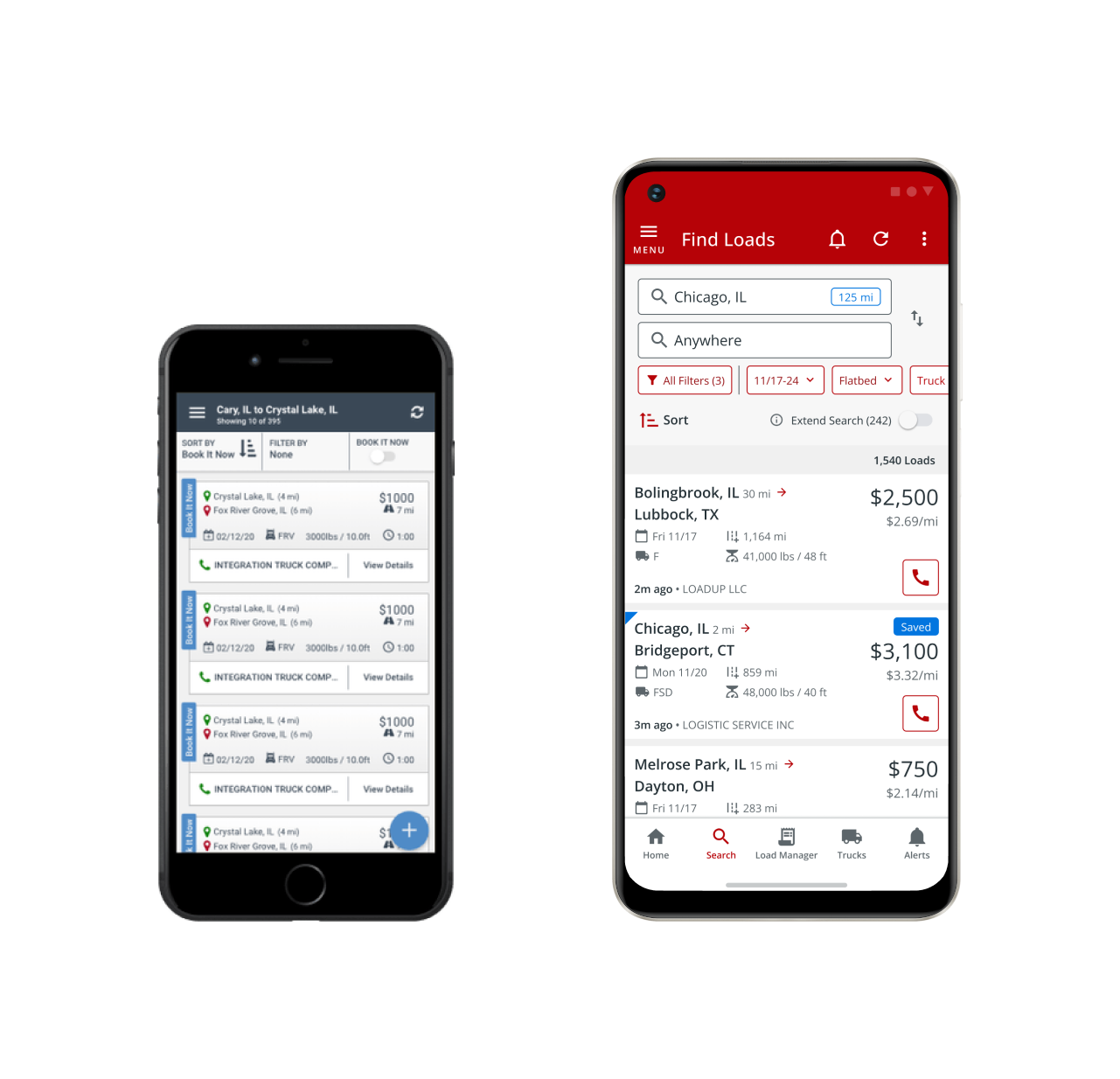
Pictured: Ancient technology (left), refined marketing asset (right)
The new app released with a skin much more in the feel of 2014, and for the direct cause of being quick to market and non-disruptive as possible for a technologically-conservative user base. The app at launch included the core functionality of four different products combined into one platform, which was a huge win for the technology department.
I came in to support the product about 6 months after launch - initially in the joy of onboarding I took it upon myself to see how the release reception was online. That was the day I learned that truckers are not hesitant to speak their mind.
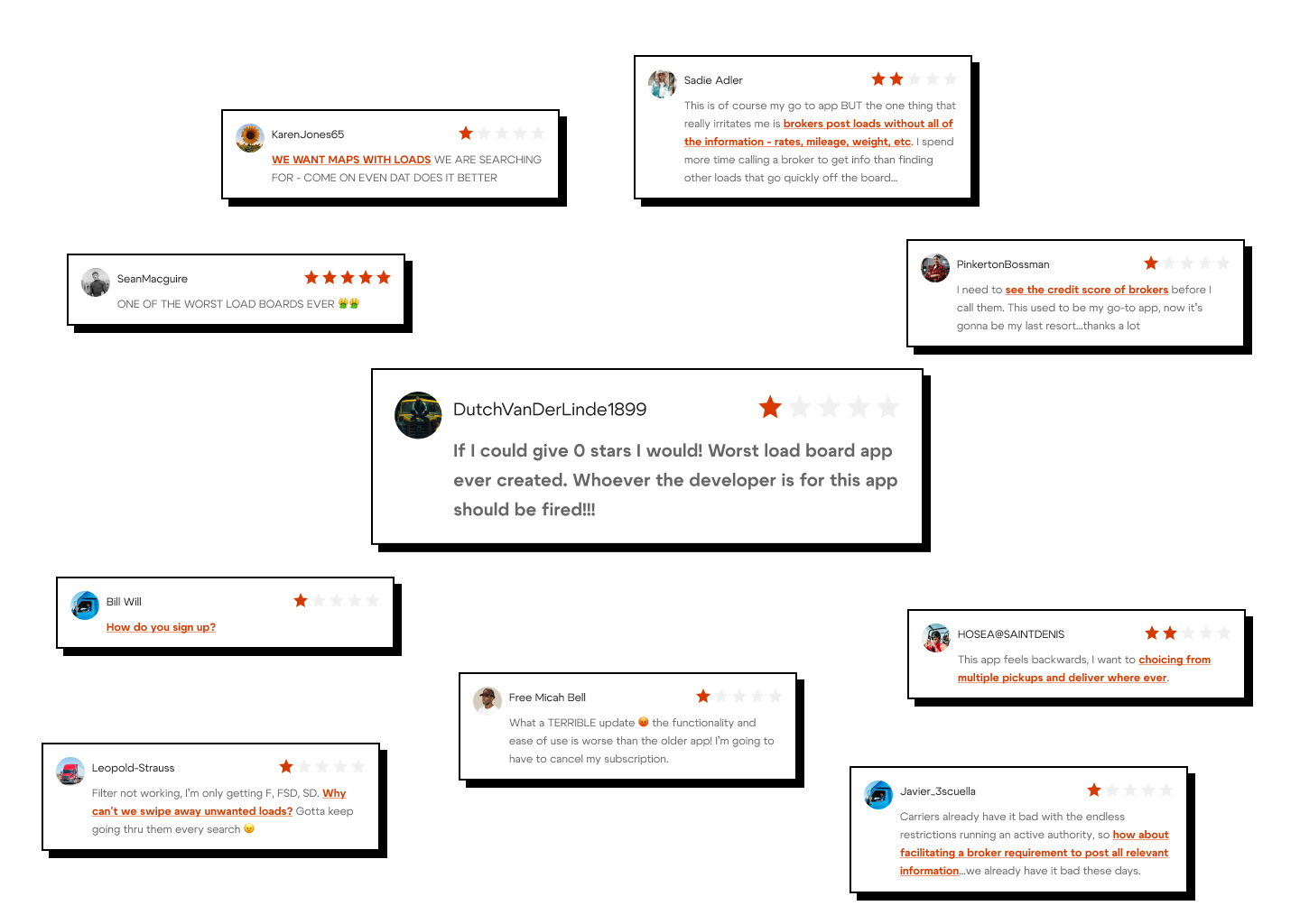
Sometimes, it's a matter of weeding through the negativity to find insights
We knew that the app had grown vastly to accommodate multiple services, but fact being, customers will never see the backstage — they care most about how it helps them get to their goals, and if user experience or service bottlenecks stand in the way, the work done on this app has been all for naught.
What has been crucial to learning about customers' frustrations has been the collaboration between our product and research teams - together we synthesized data about truckers using the services and extracted points specific to the mobile product experience. Personas for Truckstop's services are quite diverse in nature, specifically across the factors of geographical region, role in the freight matching ecosystem, experience level in that role, and their willingness to try new ideas, tools, or processes. While Truckstop has a web product, mobile has different use cases - we have to think delicately about how qualitative and quantitative data applies in the context of a user out on the road using a smaller viewport with limited connectivity.
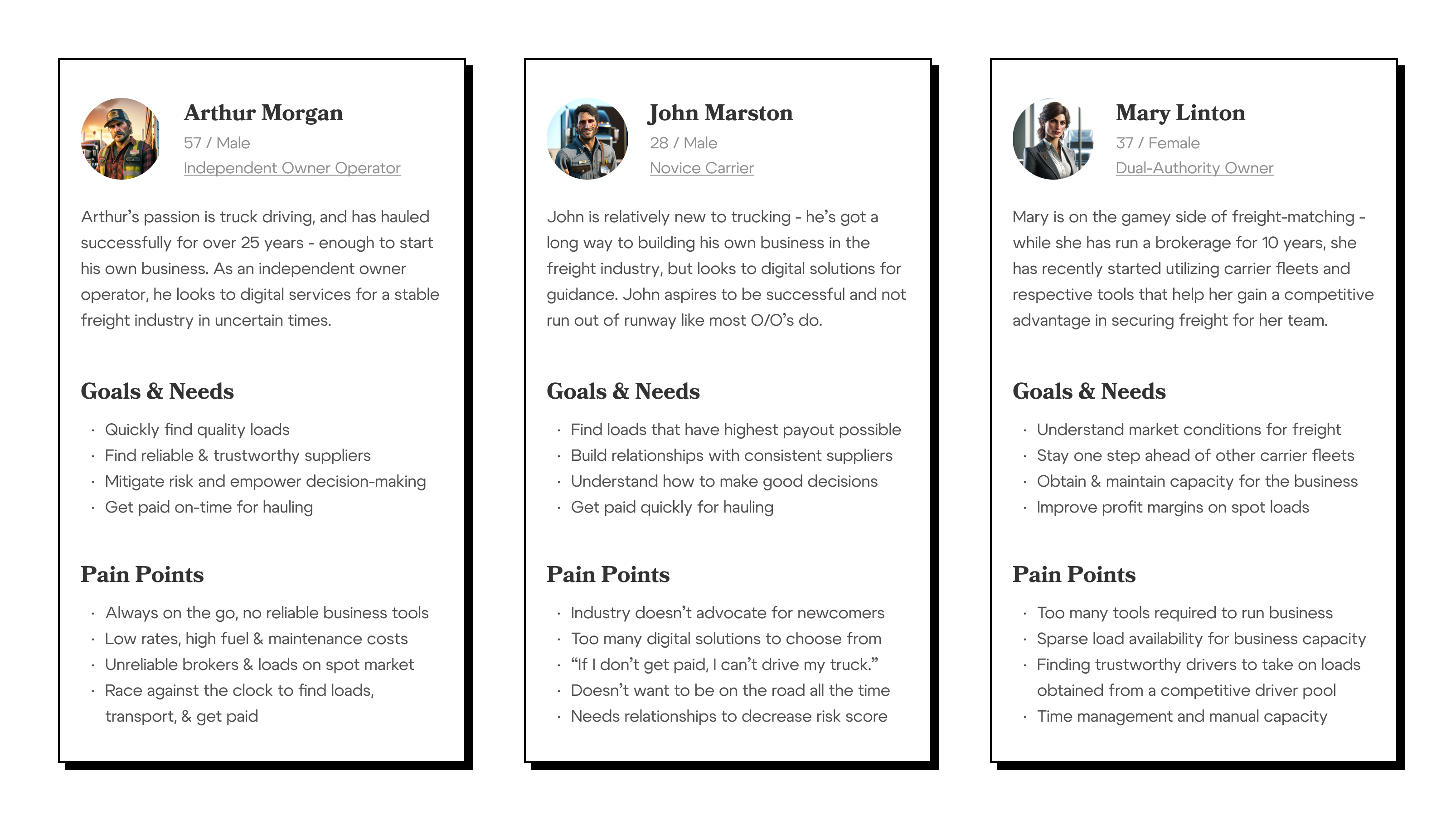
Personas become easier to identify when roles are understood in the existing ecosystem
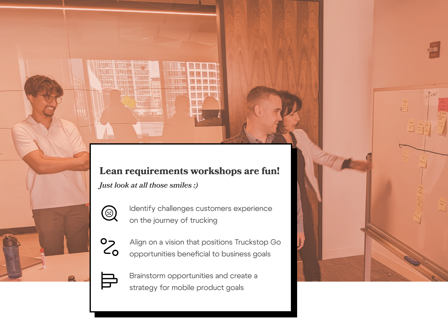
The attributes of the owner-operator personas were not just useful at the UX level - we've used them to define challenges, approaches, and actions in our product strategy. Our team hosted a workshop to align Truckstop's vision for enriching business of freight carriers with defined imperatives to deliver that value through Mobile.
The workshop had one core goal in mind: create a product strategy with clearly defined deliverables and goals that would increase retention of and engagement with customers of Truckstop. The Mobile platform has multiple opportunities that we identified in-person through customer feedback and synthesis of said feedback. Larger inputs of the strategy roll down to a roughly defined roadmap for Mobile as well as defined OKRs.
A product strategy sits on a stack, informed by company objectives and exists to drive product delivery. Our focus sat on what wins we could achieve to bring value to a mobile product, while also funneling in net-new functionality with their own feature strategy.
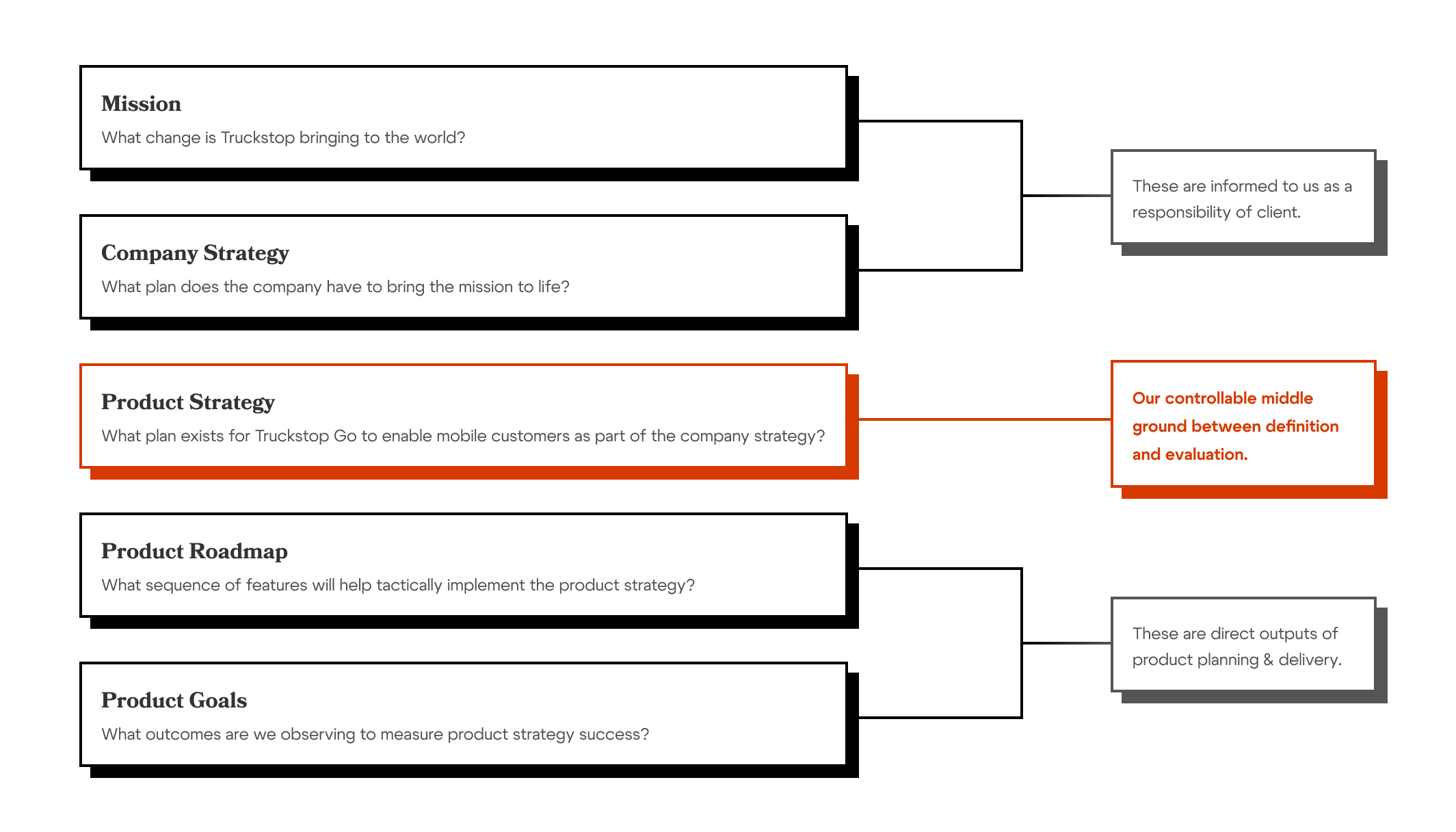
For a more in-depth explanation on the product stack, visit my friend Tim Herbig
From that strategy, we were able to deliver value upon every release - customers were provided updates that enhanced their load search experience, onboarded them to digital functionality that they wouldn't have otherwise discovered, and brought them other new initiative features that enable them to do less browsing and more trucking.
We have since seen review score average increases on Apple and Android stores, as well as NPS score increases from time of launch to more recently in assessing how many folks would promote their experiences within each product available on mobile. This work is never complete - as new opportunities are identified and as business goals change, products need to adapt to define an adjusted strategy to deliver value back to customers and business. I've used this example as a framework of explaining the bridge that UX can bring to these types of problem definition and ideating on strategic opportunities.
"Quick wins" to optimize user journeys
Load boards on mobile are not novel inventions - many freight-matching companies established this through native apps as a way for carriers to view available loads when not at a workstation. While not as granular and detailed as a desktop load board where all information is readily available, mobile load boards offer up the most relevant information to truckers when browsing.
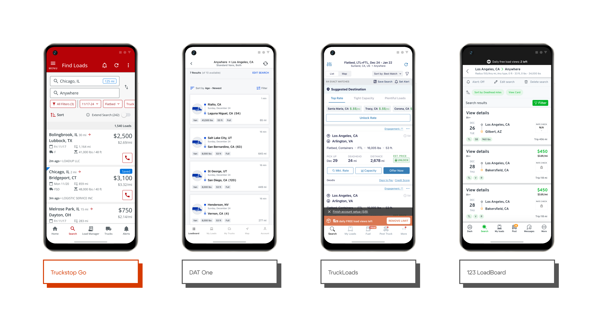
Among competitors, Truckstop Go has a distinctive visual language with its own reasons
Truckstop Go's experience approach was initially built to accelerate time on task. Presenting the controls of a search in the forefront and enabling searches when an origin input is described did result in tremendous output of total searches. But by elaborating on the user journey in this feature, I had learned that the task doesn't end at when a trucker gets a list of loads from a search, but the task should be defined as when a trucker finds and matches with a load that meets their criteria.
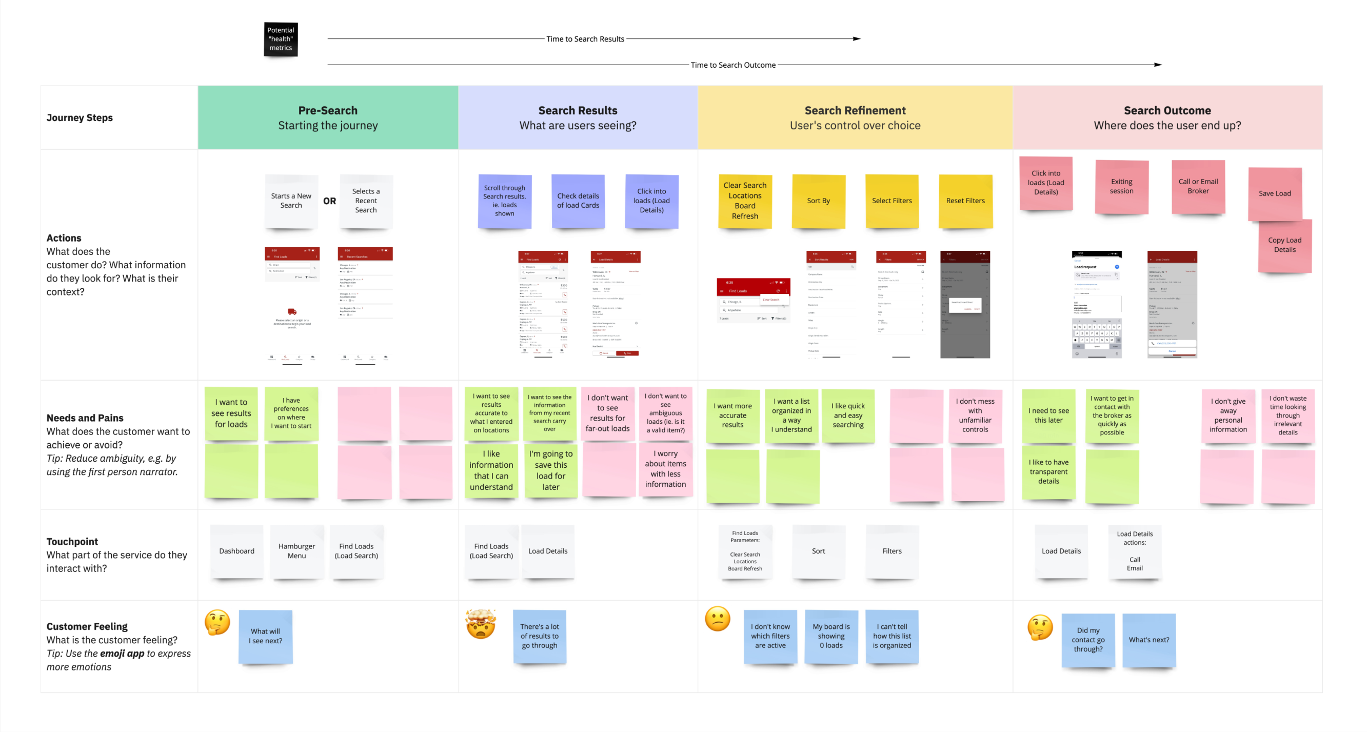
Note to self: hire a fellow freelancer to re-style this...I dislike Miro with a passion
Design ideation to align on what solution solves for the problem statement above and involves change that benefits users of that experience. My ideation process follows competitors and is influenced by Jakob's Law - a user has existing expectations and mental model for similar types of products they use on the market. This doesn't invoke much in terms of inspiration, but it's a safe measure that eventually rolls up to business benefit. If a customer new to Truckstop is provided with the same industry-standard experience they would have on DAT or 123LB, they would be already familiarized with controls and wouldn't have to re-learn a new interface.
There is a balance though - this process opens up conversations with designers, product stakeholders, and engineers in one setting, in order to understand what technical constraints stop us from bringing desired changes in functionality to implementation and release.
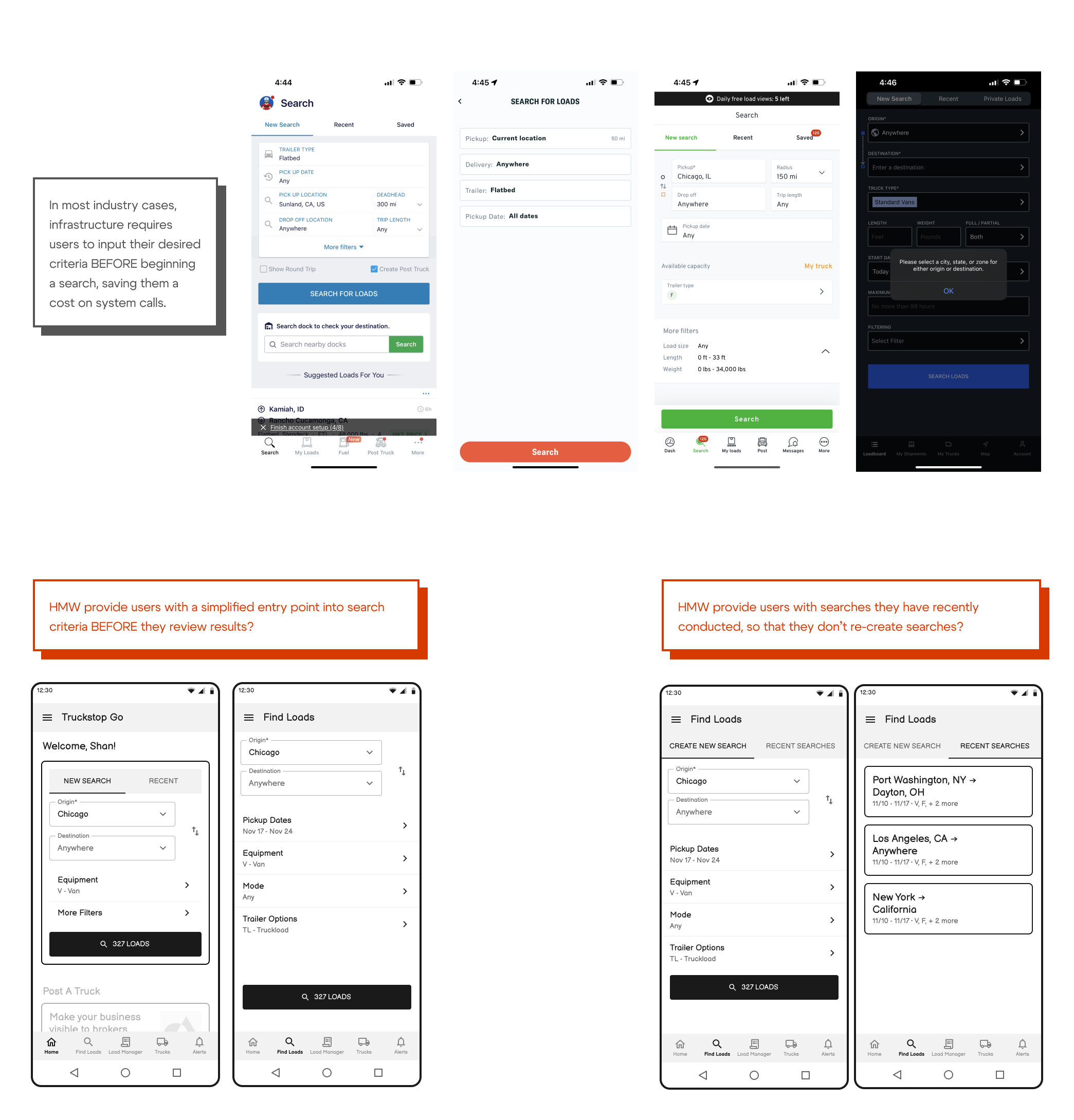
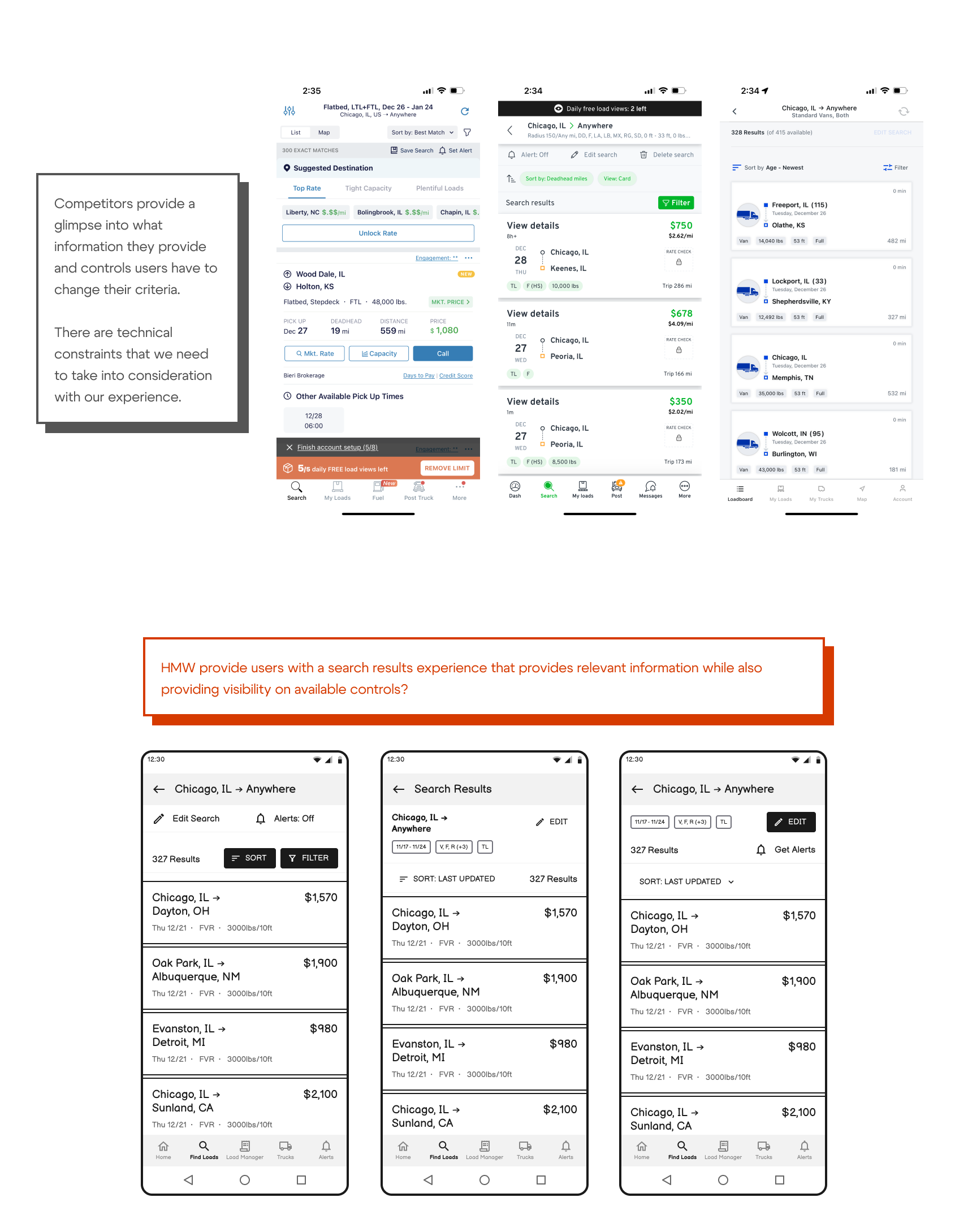
Validating a solution comes with our opportunity to test and validate - as quoted, "A prototype is worth a thousand meetings." I was able to bring feedback points together to form a solution that we can compare against the current experience as a baseline.
However, bringing the experience into this sort of "ideal state" is a larger undertaking - without the communicated ROI that these improvements bring, we won't be able to bring in engineers for this work for months. Our goal is to address questions that still need answering through direct user input - data will speak larger amounts on our hypotheses of value add, and we can use this opportunity to learn or accelerate.
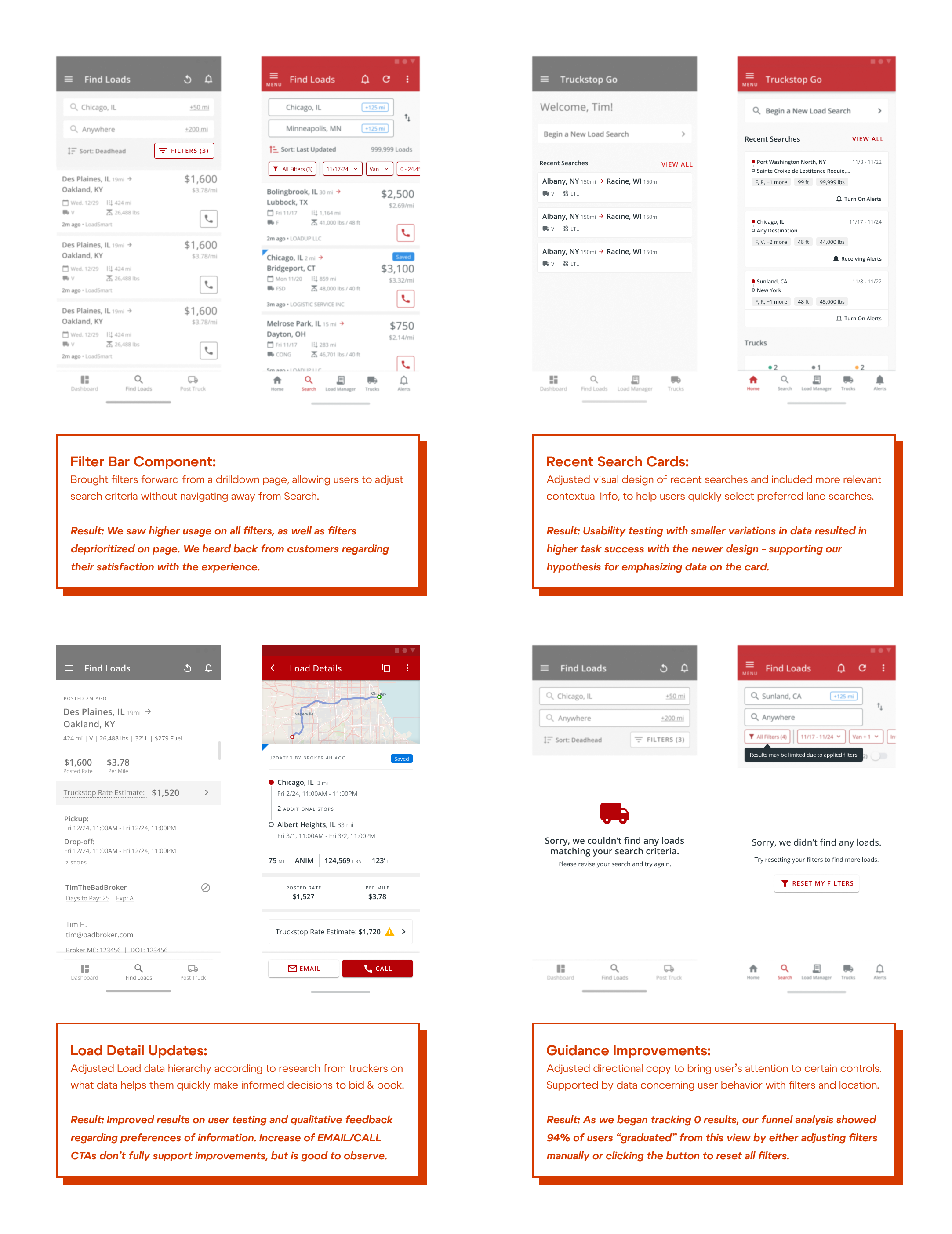
In the meantime we have achieved approaches that can be fed into the current experience. For a duration of 10 weeks I worked on smaller chunks of improvements that we could deploy every 2 weeks, with a definition of what we wanted to solve from our overarching problem statement, and what would we watch to observe success. Given our autonomy as a mobile pod we were able to quickly roll these hypotheses out and determine if there were positive or negative changes to the experience.
Customer feedback, user reviews, and analytics were the channels we used to track the performance of UX enhancements - while not all resulted in sunshine and rainbows, it gave us opportunity to identify different approaches.
"A fixer-upper" - the story of a design system in shambles
My first days on the Mobile team were spent trying to understand where certain files in Figma lived, so I could go make some circles and squares as support for onboarding. I found the file where all of our components inherited from — safe to say, it was definitely a flawed library at the time.
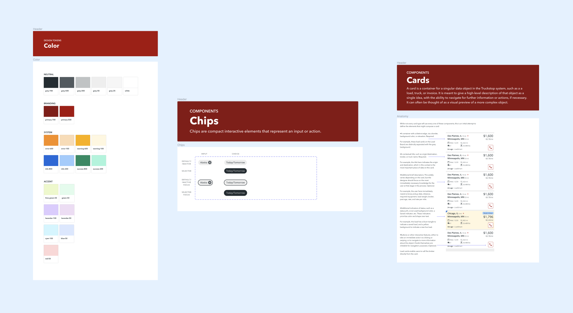
Every designer has learned in 2023 that having everything on a 'master page' doesn't fly with the rest of their org
Months had passed by where my contributions to this library were minimal and on-the-fly, primarily because of my involvement and contributions beyond UX design, in product, engineering, and strategy discussions. Visiting the component library should have the exact same feeling when you leave for vacation and come back to a clean and sparkling home - except my digital organization amounted nowhere near my physical tidiness. (For reference, my desktop is overflowed with design screenshots and my email inboxes still have badges in the thousands).
So during the year when dark mode was prioritized as a need for mobile users operating the app at night, I quickly realized that our library needed the leg work of a whole team of designers, or a ton of crunch hours. On top of that, the app was built using Flutter's frontend framework, with our constraints to budget and time limiting us to Material 2 (once again, a reference back to 2014).
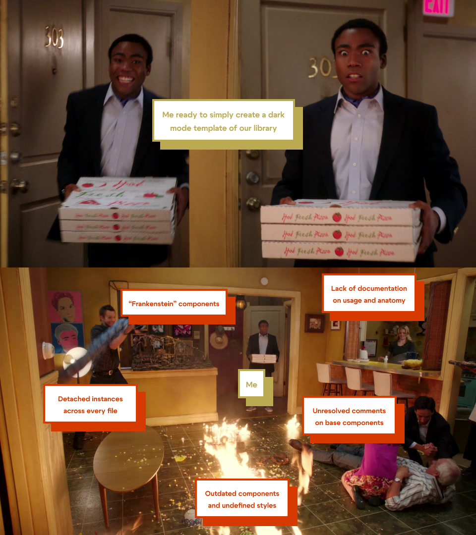
Without typing another whole paragraph, I'd like to present my craftiness via meme template
Our design backlog was a conduit for addressing and beginning the groundwork on UX stakeholder discussions. Initially our backlog was flush with requests to audit the pattern library from the ground up - I had to weave in a process in which we could intake an analysis of each component and account for effort it would take to provide an update on each, for both design and engineering effort.
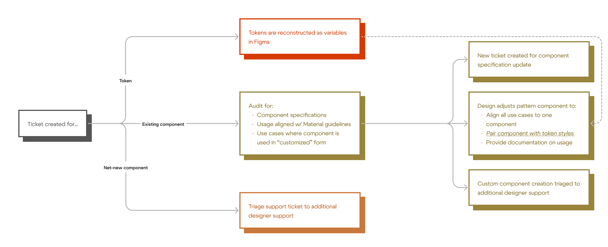
Subconsciously, we had based our transformation on principles from the Brad Frost methodology for atomic design - and quickly ditched the chemistry-esque nomenclature for something more engineering-friendly. Our approach to definitions were as follows:
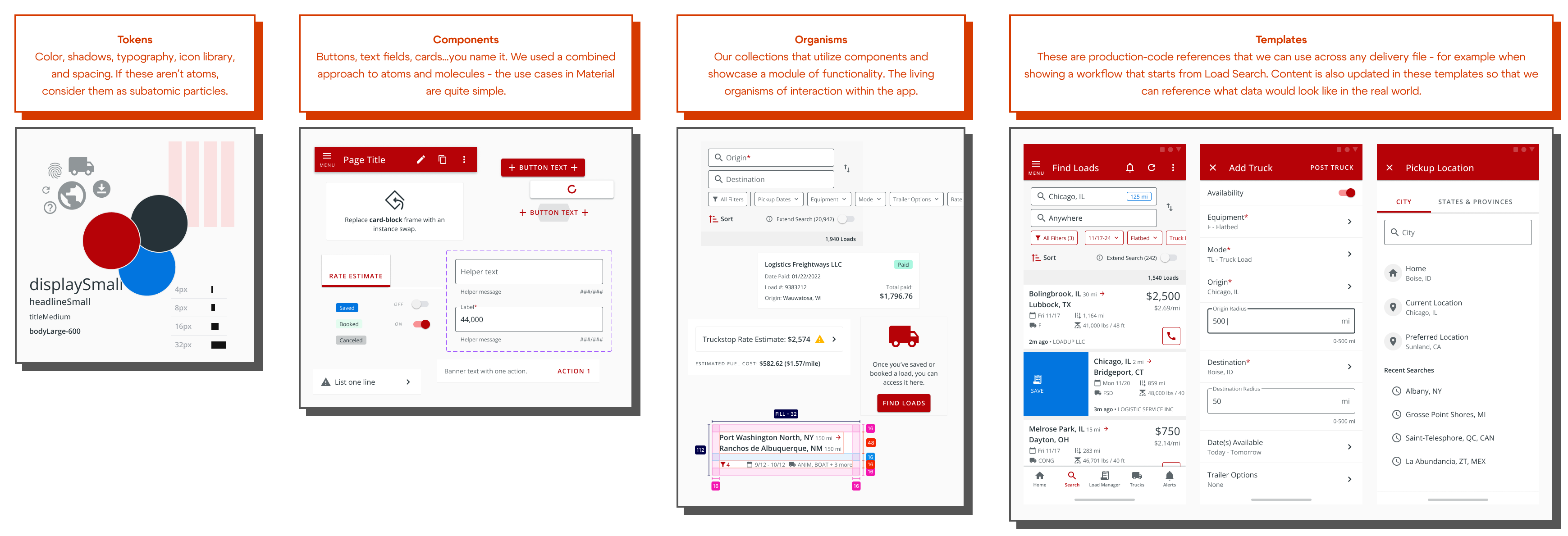
Our documentation for new designers, product managers, and engineers also had to be refined to bring in the immense wealth of knowledge that I myself had along with front-end engineers who were using components for rapid implementation. I would say the most important piece of this was setting expectations where we strictly followed Material guidelines as it was defined for Flutter, while also providing context on where we took liberties to meet the requests input from UX, marketing, and product.
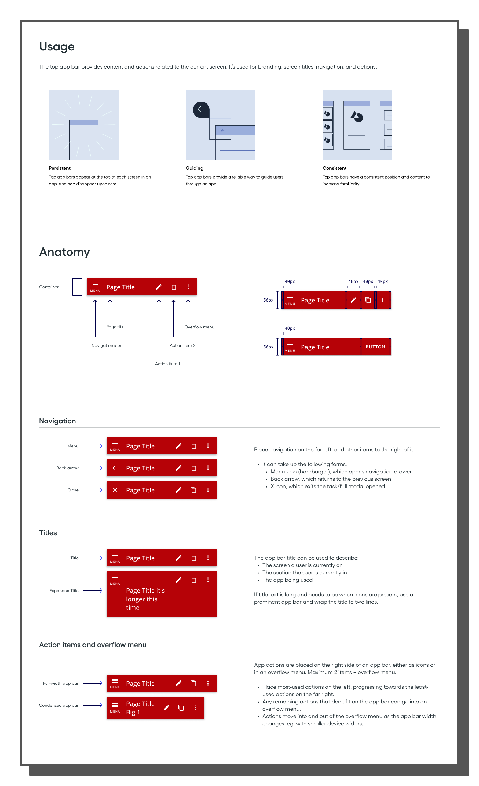
Today, this pattern library stands on its own but I still cannot confidently call it a full design system.
By the time you've read this you've probably done some research on Truckstop and noticed a different feel on the web app. Because of the differences of nature between web and native implementations, because of the different frameworks used, and because of the decisions made by two different teams, the two products stand out from one another. Our product goal for next year is to realign the two platforms through a governance process - one in which we can input a lot of decisions already made on web, but also where mobile has some flex to provide its own reasoning to changes - and have all decisions validated through data, feedback, and testing. I feel pretty confident we can kill two birds with one stone on this process as Flutter flips the switch for Material 3, and we can do some foundational work to ask the right questions and get closer to alignment...stay tuned for the rest! ▨ -s