My humble experiences in designing for social e-commerce
Lessons learned from transforming e-commerce at Basic.Space
Like every problem space I've been through in my career, e-commerce was my next new frontier when I joined Basic.Space back in 2021. The team I was placed under was rag-tag, emotional at times, but tied to an ambitious vision: a curated shopping experience by the seller.
I often don't like talking about my work at Basic, due to the fact of when I show my chosen design work from about 4 years ago, people then go to the website and see that it has dramatically changed. And, to a point, I think that's the expected rollover speed of a volatile, gritty, and evolving fashion industry - expecations change, and that change is loud, whether it's coming from a customer or from a key investor.
So, I welcome you to a different type of case study - where I revisit some of my stories in true blunt fashion, and reflect on what could have been.
Am I happy with what I built?
Imagine early 2021 - cryptocurrency is on a steady bull run, the use cases for crypto are being explored by giants like Visa and Goldman Sachs, and there is an emergence of the non-fungible token (NFT).
You probably already see where this is going.
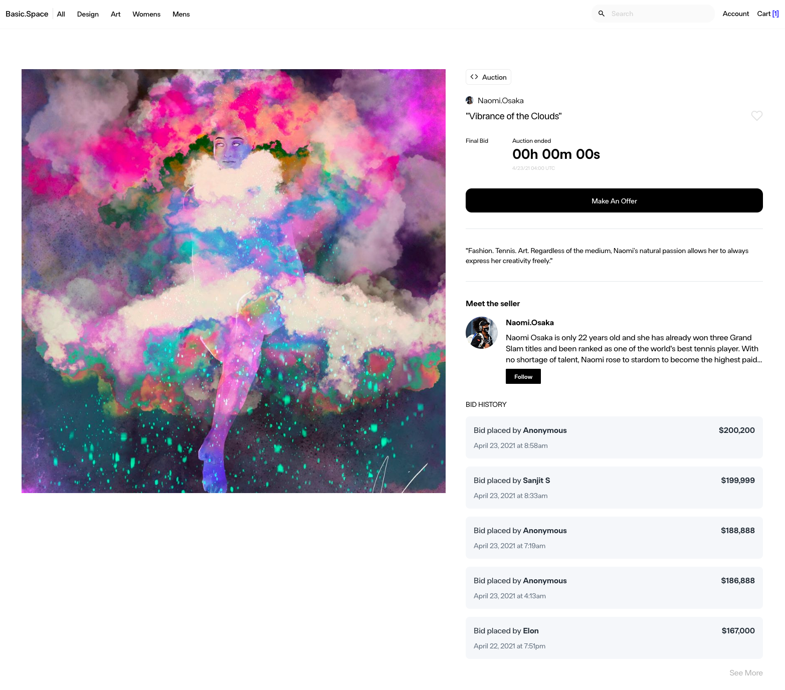
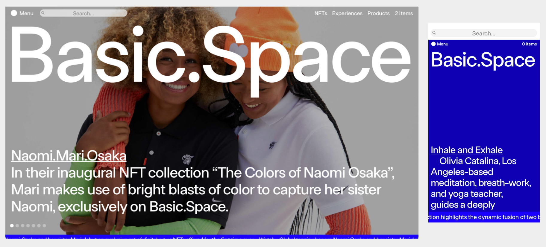
The very first 4 weeks of my time @ Basic was spent leading design for new auctioning functionality of the site. Some of our marketing gurus had been in indirect conversation with Naomi Osaka and her sister Mari. Mari is a great painter, and some of her work was in discussion of being hosted as, well, NFTs, transferred through the Flow network.
So with 4 weeks on the clock, myself and the team had to be methodical about where we spent our time. Some of it spent in meetings, but most working asynchronously to make sure we approached a goal for a design handoff. I pulled out some of my notes a while ago and I'm quite surprised at the influence sketching had on our final product - not just in interpreting requirements, but making recommendations to requirements through functionality we initially hadn't supported on the platform.
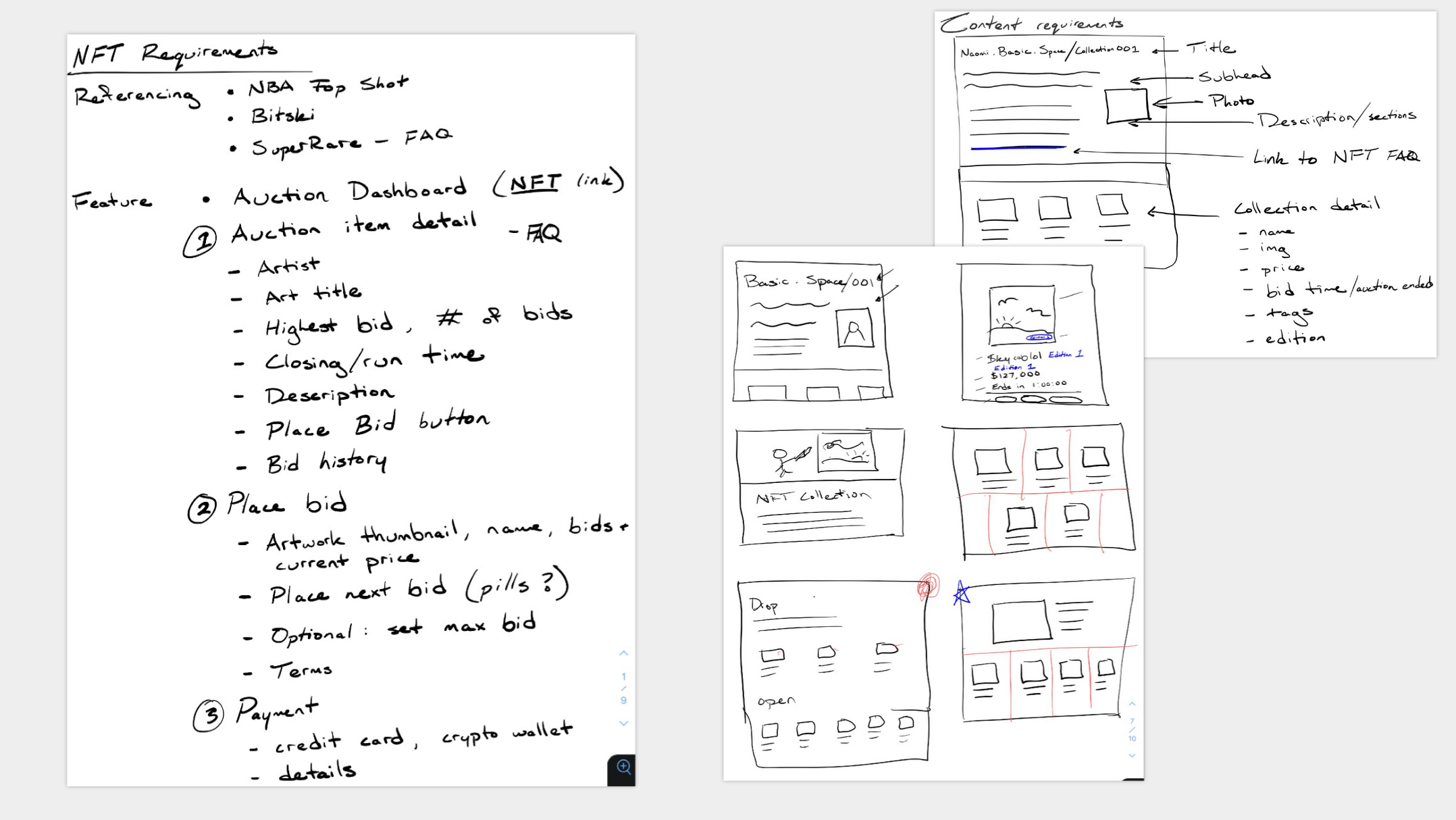
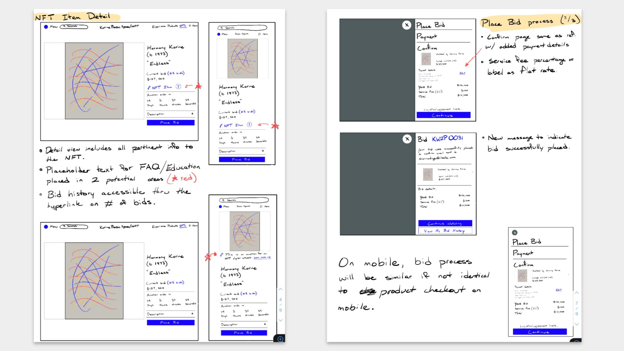
Once we packaged together wireflows and conducted a full design review, we happily shipped this off, waited for marketing to flip the feature flag switch and watched the bids roll in.
And within 7 days, the auction was complete, and it was over. We hosted the bidding totals high and mighty on our product listings, to show the investment and excitement gathered for this type of art.
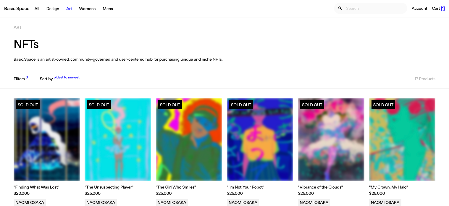
From that point onward, our team never touched the NFT listings again. We didn't ever discuss additional listings. We did discuss at some point the ability to resell listings, but that never came to fruition. We didn't even roadmap for what NFTs as a product within a decentralized ecosystem would look like on a platform like Basic.Space.
Desipte all this, I have a borderline controversial opinion when it comes to NFTs. I don't think they're a rug pull or are scammy by any means. A coworker explained it to me concisely - NFTs are a way to decentralize proof of ownership and the transfer of that ownership from entity to entity.
Think of it this way - imagine your typical ledger such as a health record. Information and the chunks of that data might sit siloed across different sources, HCPs, and written records. And let's say that an application for NFT technology could be the birth certificate. As the owner of that information, you could authorize and display relevant information to a person who might be requiring that information for your employment, they just need your consent. And instead of keeping written copies, or having to contact person after person to retrieve that information, it sits securely on a network only accessible by an encrypted key.
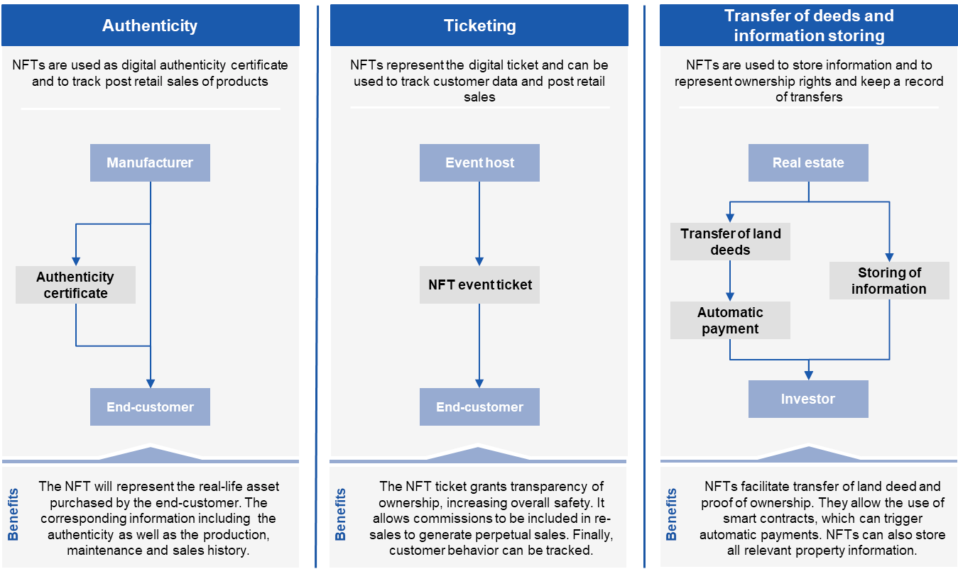
The use cases for NFTs are so vast but also so unrealized. Why? Because there is a lot of middleware from the biggest industry use cases that solely benefit from existing as middleware. Use cases can't be realized in regulated spaces or with stakeholders who won't budge. And so NFT use cases were transferred to more accepting domains, like art, entertainment, sports...but the key point of ownership was missing, eg. someone just taking a screenshot of the art could consider they own it, similar to those taking a picture of the Mona Lisa.
So, was I satisfied with my design output within such a rapid timeframe? Absolutely.
Was I happy with the outcome of the launch? Probably not.
There are a lot of things I would change, but that comes with a level of influence and expertise in the area; our team took the promise of NFTs upfront without further research on how we support that ecosystem. I've started to take my own strides to understanding emerging technologies, before designing for them.
Admittedly, this one just felt a bit beyond my control.
Conversion speedrunning via conventional design
All e-commerce companies survive off their inherent ability to convert a wandering visitor into a customer. What happens when user experience gets in the way of that?
Somewhere in my onboarding there was enough investment for me to carry out a usability audit through the site's purchasing journey. A few alarms rang along the way:
A nightmarish hero with low-res image content and no indication that content exists below the fold.
A minimalist-inspired shopping experience, where filter selections remain invisible and where 1 row of product listings take up most of the viewport.
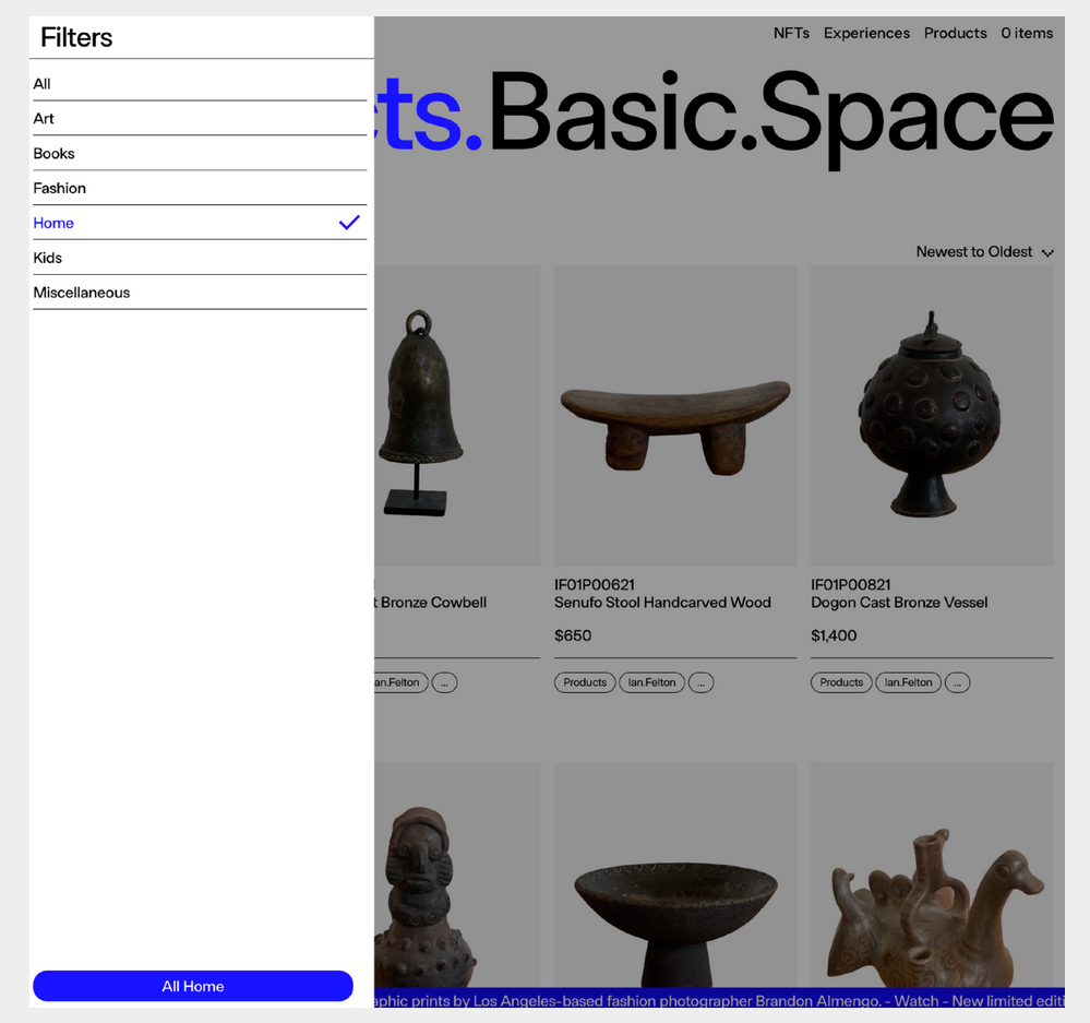
Cryptic product listings, with no infrastructure supporting discovery of recommendations or similar product listing.

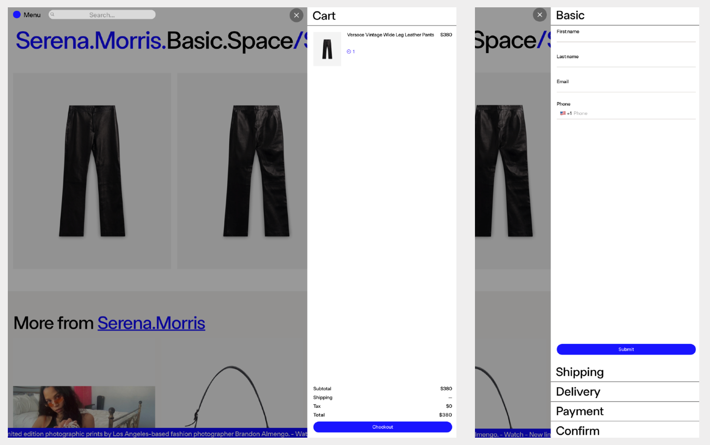
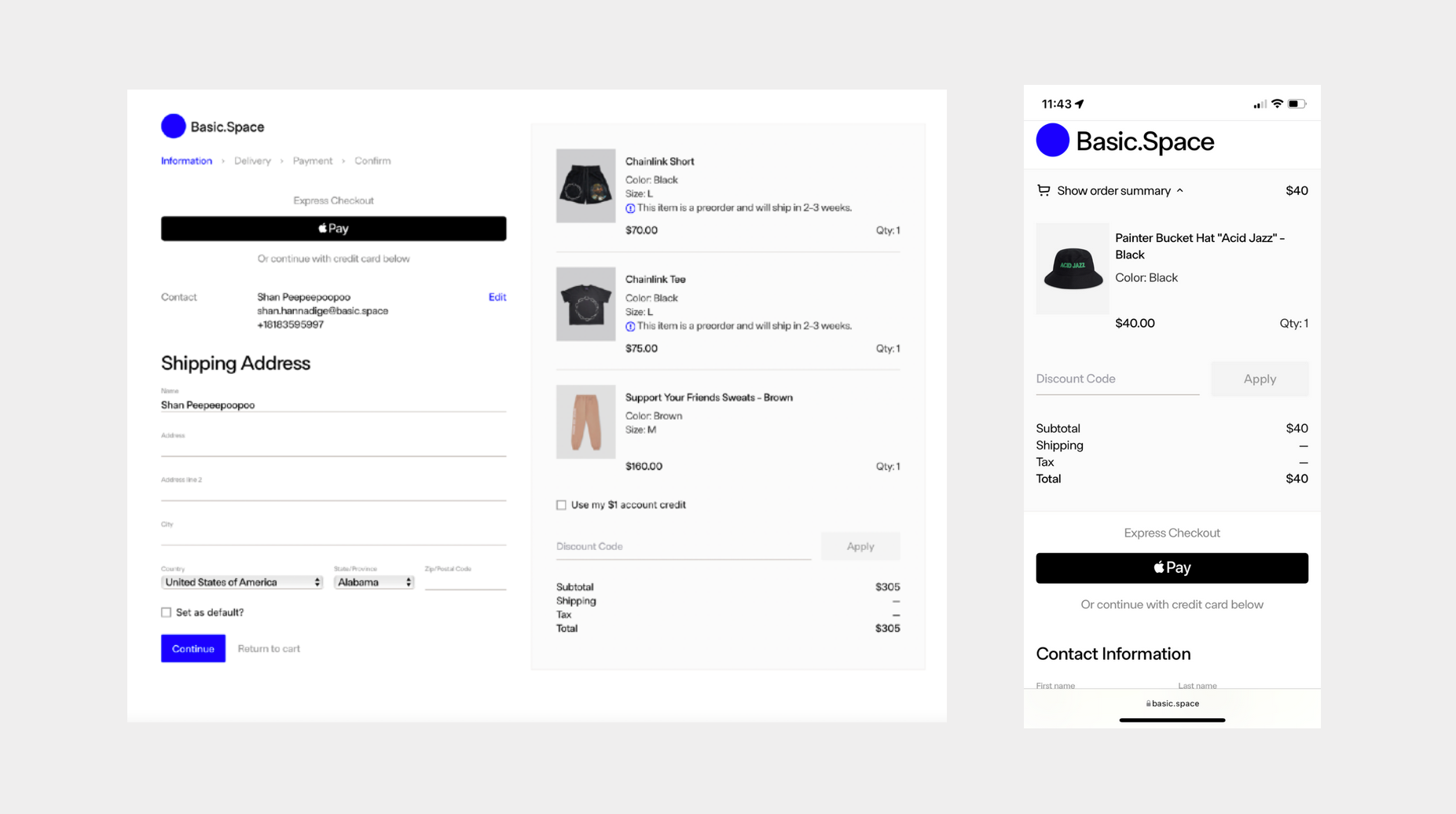
A checkout experience chock-full of form usability issues. Cherry on top: accidentally click off into the scrim, and your progress is completely lost.
The key component in winning influence over design decisions on the purchase journey was supporting evidence on an increase in conversions. We were able to find evidence pretty sparsely.
Most of that required taking notes on traditional e-commerce patterns. If TheRealReal was doing successfully without creating abstractions from the shopping experience, I would copy it. If some guy on Instagram reselling Chrome Hearts apparel out of his house was just using Shopify for his sales, I would copy it.
I say the word "copy" as a light note, rather I would "realign" our design to other competing sites. I've been a preacher of Jakob's Law:
"Users spend most of their time on other websites, so they expect your site to work like all the other sites they already know. When a design deviates from users’ expectations, usability suffers. Don’t be arrogant and assume that your new design idea is so brilliant that it can overrule decades of user habituation."
So unremarkably, we stuck to the basics. Refreshed the homepage, tidied up product listings, and gave a second and third thought to our checkout process.
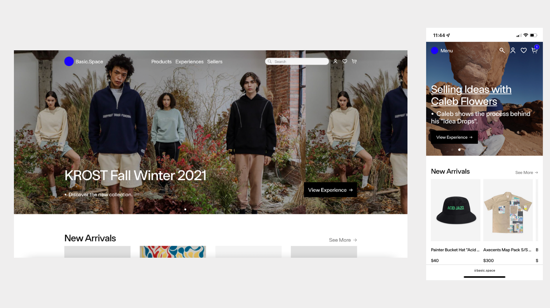

While the design is somewhat unremarkable, it does the job. Mixpanel events helped us understand that our design updates were taking significant amounts of users from the homepage to product listing pages, and they were mitigating the flow of users off of the site.
What's more remarkable though, was that we were seeing conversions. Not because of some flashy new handbag on the store or the fact that someone sold their entire Land Rover on the platform - but because users were actually making it through to the end of the checkout process.
People often ask me why I find web UX design a bit boring at times - mainly, it's because simpler is better. We have loads of HCI research that has supported the need for certain UX patterns, we have design systems for usage of those patterns in everyday application, and we have designers who speak to those patterns through experience and expertise.